Entangled footprints
Understanding urban neighbourhoods by measuring distance, diversity, and direction of flows in Singapore
Traditional approaches to human mobility analysis in Geography often rely on census or survey data that is resource-intensive to collect and often has a limited spatio-temporal scope. The advent of new technologies (e.g. geosocial media platforms) provides opportunities to overcome these limitations and, if properly leveraged, can yield more granular insights about human mobility. In this project, we use an anonymized Twitter dataset collected in Singapore from 2012 to 2016 to investigate this potential to help understand the footprints of urban neighbourhoods from both a spatial and a relational perspective.
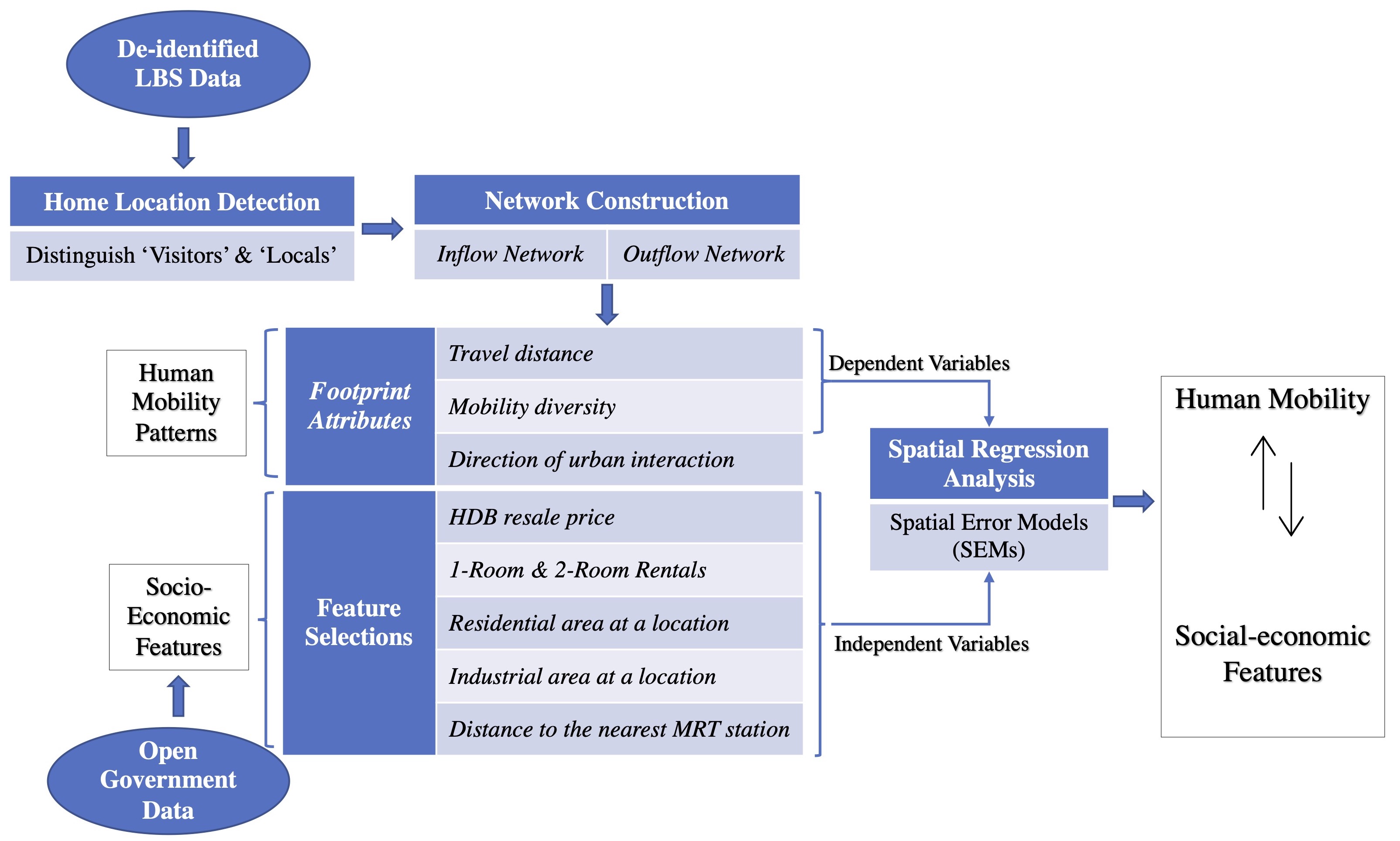
We construct home-to-destination networks of individual users based on their inferred home locations. In aggregated form, these networks allow us to analyze three specific mobility indicators at the neighbourhood level, namely the distance, diversity, and direction of urban interactions. By mapping these three indicators of the spatial footprint of each neighbourhood, we can capture the nuances in the position of individual neighbourhoods within the larger urban network. An exploratory spatial regression reveals that socio-economic characteristics (e.g. share of rental housing) and the built environment (i.e. land use) only partially explain these three indicators and a residual analysis points to the need to explicitly include each neighbourhood’s position within the transportation network in future work. Figure 1 displayes an overview of research outline.
Distance of flows
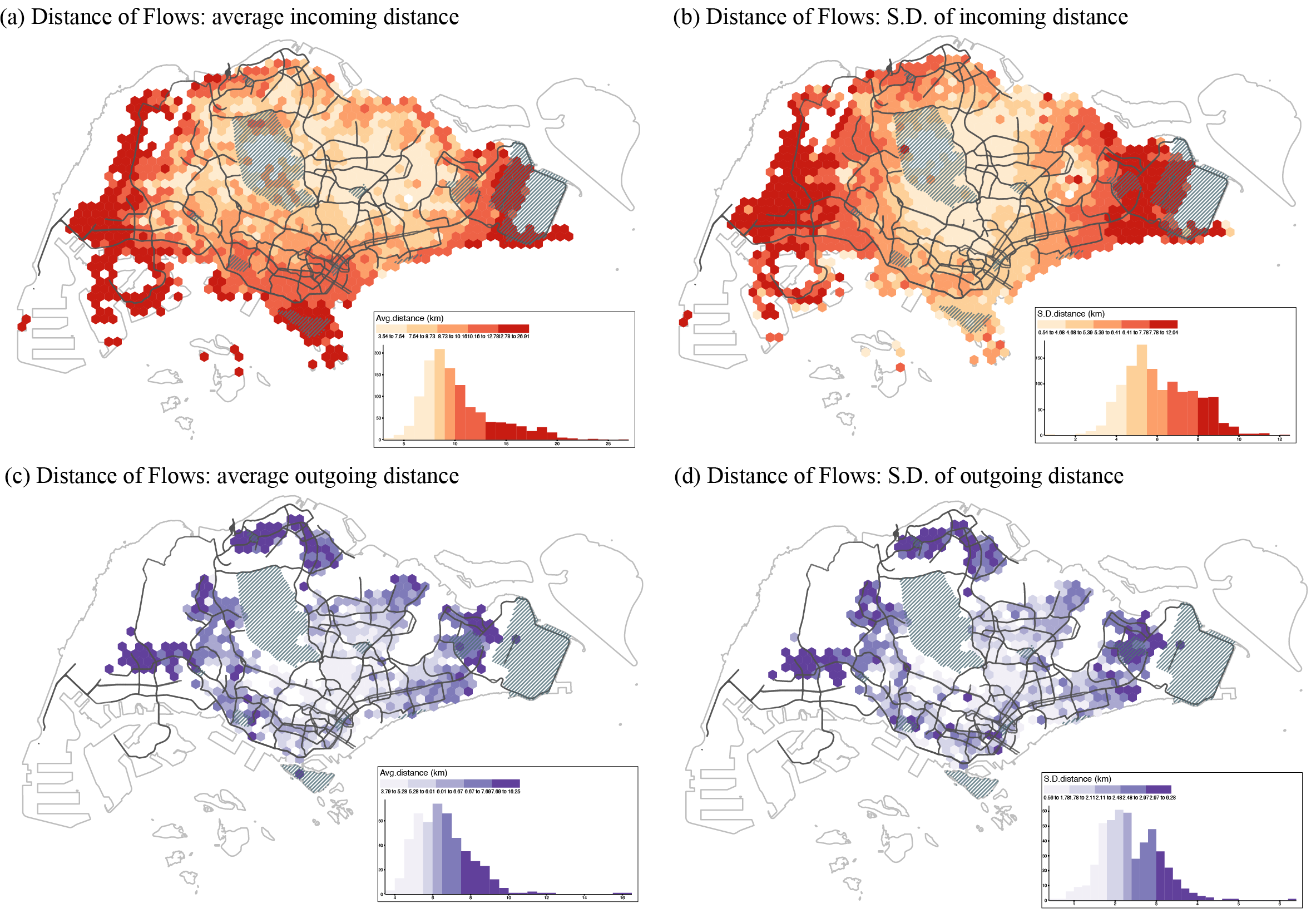
Based on the home-to-destination networks, we measure both incoming and outgoing travel distances for each neighborhood. For each neighborhood, the incoming distance is estimated based on trajectories of visitors between the centroids of their home locations to the centorid of that neighborhood, and the outgoing travel distance is estimated based on the trajectories of locals between the home neighborhood centroid and the centorids of all other neighborhoods they’ve visited.
Figure 2 visualizes the mean and standard deviation of the travel distance in each grid cell for both inflow and outflow networks. The mean travel distance for the inflow network is about 10.3km (S.D. 6.1km). We can see that neighborhoods with a large travel distance (>10km) generally appear around the edges of the city, notably in the west, east, and southern regions. Part of this can be explaned due to Singapore’s island geography, but on closer inspection neighborhoods with such a high distance tend to be fairly specific. For the outflow network, the average travel distance is around 6.6km (S.D. 2.4km), which is lower than that of the inflow network. This is because the outflow is based on people’s home location and thus captures their overall mobility footprint, while the inflow includes all types of locations (residential and non-residential) thus also covers special urban functions that are travelLed to over relatively large differences, but far less often than (nearby) daily errands. Here we observe a pattern emerging in the peripheral areas where people travel longer distance thaan those living in the central areas.
Diversity of flows
To operationalize the metric of diversity, we measure the inflow and outflow diversity according to the variety and intensity of the origin neighborhoods (for inflow diversity) and destination neighborhoods (for outflow diversity). Figure 3 shows an example of how we create unique and dynamic concentric sectors for each neighborhoods for diversity measurement using Shannon;s diversity index.
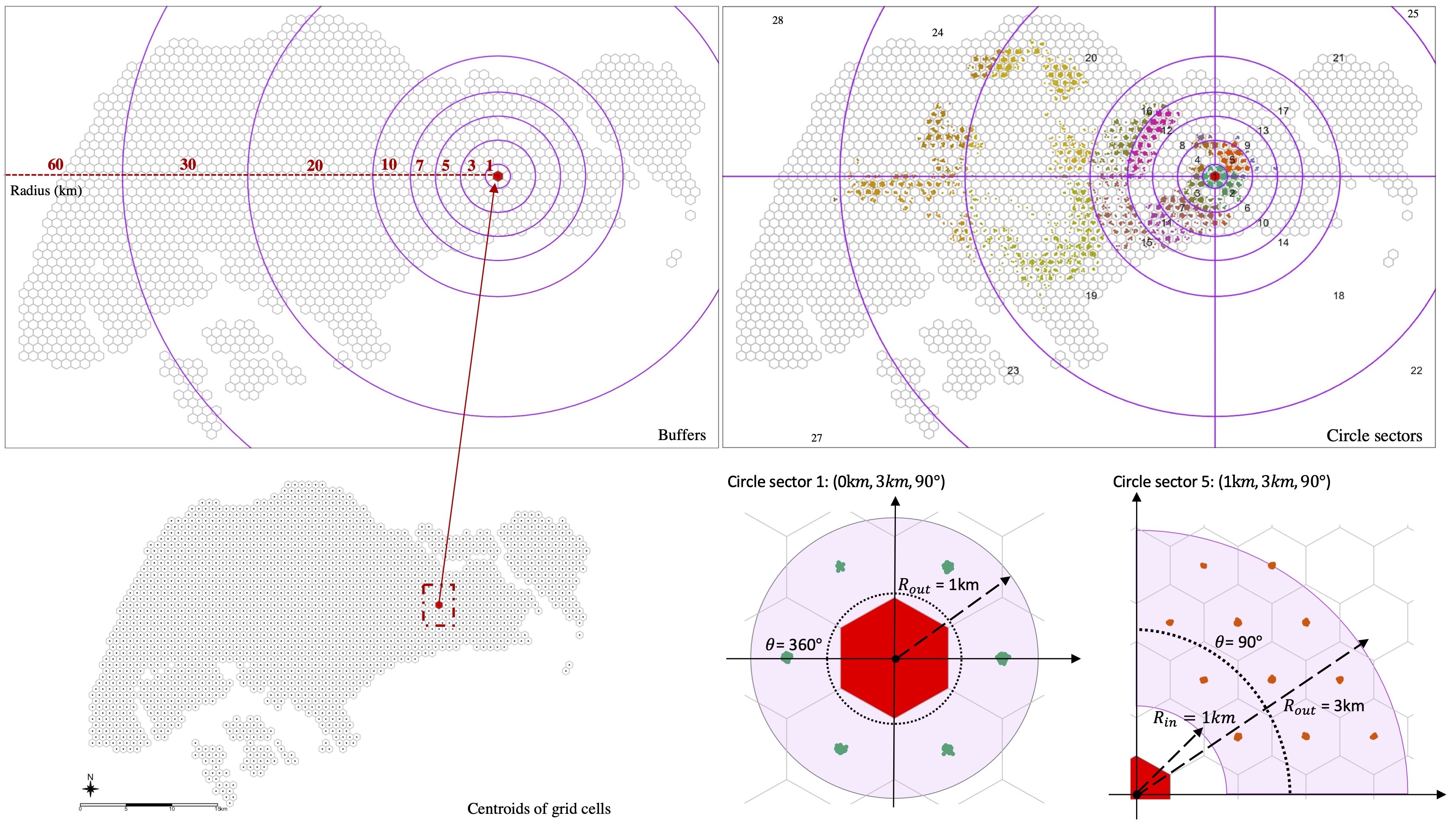

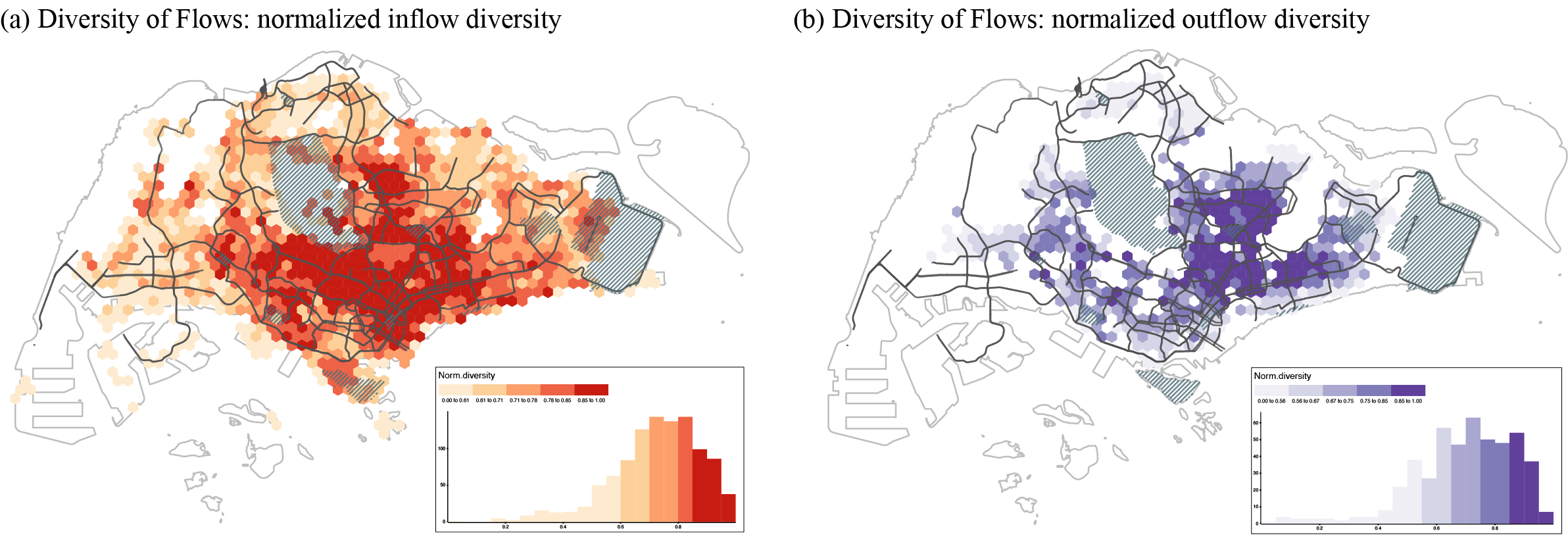
Figure 4 visualizes the diversity of flows for both the inflow and outflow networks. We observed that the city centre displays a high inflow diversity, which corresponds with its central urban function within Singapore. It also benefits from the road and public transportation networks that are built to coverge on this area. In contrast, the outflow in the area is relatively low, indicating residents living near the centre might not have to travel widely to meet their daily essentials.
Looking beyond central urban functions, we can zoom in on some regional centres in the city, as designated in the Concept Plan 1991. Tampines - located in the East region of Singapore, is one such centre and is also one of the most populous residential areas in Singapore. Tampines has modest scores of inflow diversity, indicating that it generally services residents from a limited set of (likely nearby) neighbourhoods. Its outflow diversity is relatively low as well, which indicates its residents can obtain their daily needs locally, corroborated by the relatively low travel distance in Figure 5c. It is a testament to the relative success of Tampines as a regional centre, with its provision of shopping malls, hawker centres, other retail amenities, as well asa sizable number of jobs.
Direction of flows
Flows into or out of a neighborhood can happen in all cardinal directions and with different intensities and distance. Visualizing the entire network of these connections is not very insightful for making neighbourhood-level inferences. As such we create a single metric that summarizes the overall direction and strength of flow to or from a neighborhood.
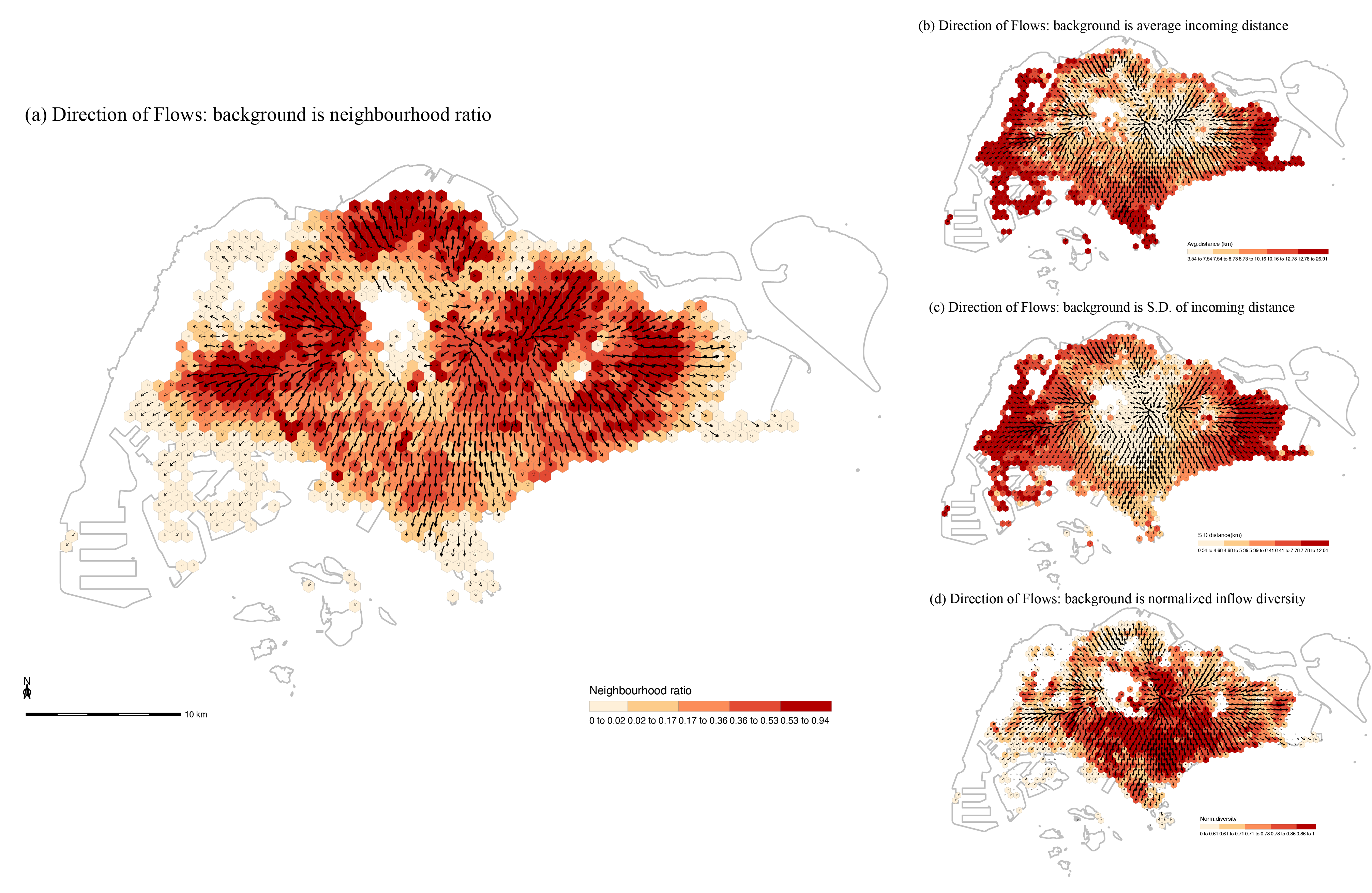
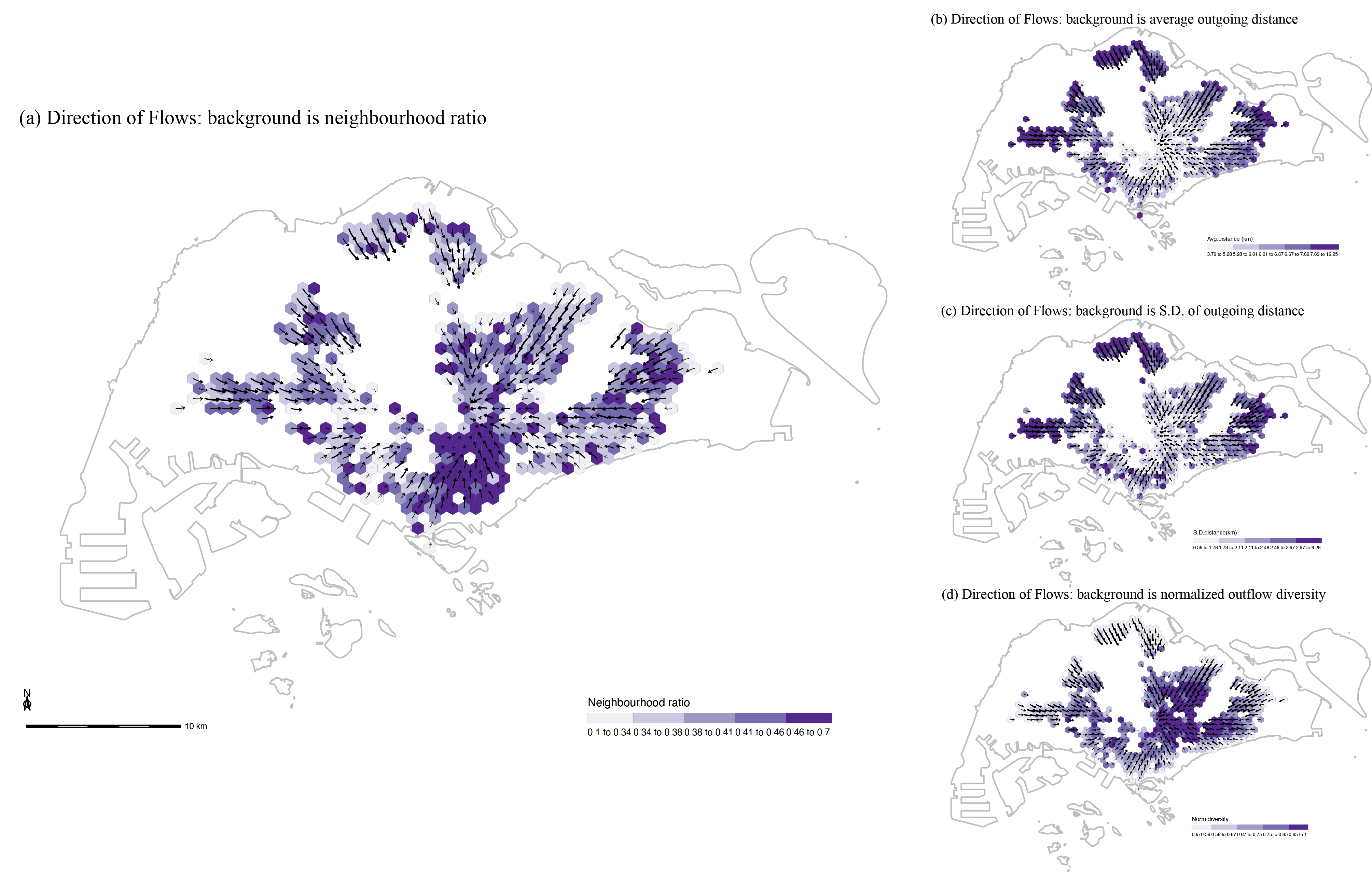
Figure 5 and 6 visualize directional summaries for each grid cell as a vector flow map. To provide a context for these flows, we display a neighborhood ratio in the underlying choropleth map. The neighbourhood ratio is measured based on the weighted number of tweets sent within 3km from the geographical centre of the visited neighbourhood for the inflow network or from the geographical centre of the home for the outflow network. To make comparison across maps easier, the mean travel distance, the standard deviation of travel distance, and the diversity of flows are also presented in sub-figures.
From the inflow netowrk shown in Figure 5, it seems that the directional orientation of neighbourhoods in Singapore does not exhibit a monocentric pattern, but a rather polycentric one where footprint flows anchor onto a series of sub-centres. It should be noted that this pattern is likely to shift when we would only focus on, for example, commuting interactions but the LBS dataset here does not differentiate between different types of interactions. In the outflow network displayed in Figure 6, we observe a starkly different spatial pattern, where the direction of outgoing interactions does focus heavily on the centre of Singapore. This does not necessarily mean that all residents, or even a majority, travel all the way to the centre, as this may solely reflect flows in the general direction of the centre to locations before or after the centre itself.
For more details of this project, please check our paper here. Besides, all data and code needed to reproduce the results and figures in this study are available at entangledfootprints. You can also install the compendium as an R package, entangledfootprints, from GitHub with:
# install.packages("devtools")
remotes::install_github("spatialnetworkslab/entangledfootprints")
Chen, Q., Chuang, I.-T. and Poorthuis, A. (2021) Entangled footprints: Understanding urban neighbourhoods by measuring distance, diversity, and direction of flows in Singapore. Computers, Computers, Environment and Urban Systems, 90, p. 101708. https://doi.org/10.1016/j.compenvurbsys.2021.101708